At North Road we are currently running a crowdfunding campaign to sponsor work on a new “Point Cluster Renderer” for QGIS. This is a really exciting new feature which would help make possible some neat styling effects which just aren’t possible in QGIS at the moment. The campaign is now in its final hours and we’ve still got some way to go to reach the campaign goals. If you’re interested in seeing this feature happen, now’s the time to jump onboard and contribute to the campaign!
Before time runs out we’d like to share some more details on how the cluster renderer can be enhanced through the use of data defined symbol overrides. Data defined overrides are where a huge part of QGIS’ symbology power resides. If you’re not familiar with them, we’d suggest grabbing a copy of Anita Graser and Gretchen Peterson’s reference “QGIS Map Design” (seriously – buy this book. You won’t regret it!). Basically, data defined properties allow you to set rules in place which control exactly how each individual feature in a layer is rendered. So, for instance, you can create an override which makes just a single feature render in a different color, or with a larger label, or so that all features with a value over 100 render with a bold label.
We’ve designed the point cluster renderer to take full advantage of QGIS data defined symbology. What this means is that the cluster symbol (ie, the marker which is rendered when 2 or more points are sufficiently close together) will respect any data defined overrides you set for this symbol, and each individual cluster symbol can have a different appearance as a result.
To make this even more flexible, the clusterer will also provide two additional new variables which can be used in data defined overrides for the symbol. The first of these, @cluster_size, will be preset to equal the number of features which have been clustered together at that point. Eg, if the cluster consists of 4 individual neighbouring features, then @cluster_size will be 4 when the cluster symbol is rendered. This can be used to alter the appearance of the cluster symbol based on the number of associated points. The mockup below shows how this could be used to scale the cluster symbol size so that clusters with more points are rendered larger than clusters with less points:
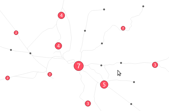 In this mockup we’ve also used a font marker symbol layer to render the actual cluster size inside the symbol too. Of course, because almost every property of symbols in QGIS can be data defined there’s almost no limit how @cluster_size could be used – you could use it to change the symbol color by pairing it with QGIS’ ramp_color function, or alter the symbol opacity, or the outline width… basically anything!
The second new expression variable which would be introduced with the cluster renderer is @cluster_color. This variable allows you to access the color of the points contained within each cluster. Since the cluster renderer is built “on top” of an existing renderer, any point which is NOT contained within a cluster is rendered using the specified renderer. For example, if you use a categorized symbol renderer then all points which aren’t in clusters will be drawn using these categorized classes. In this case isolated points will be drawn using different colors to match the predefined classes.
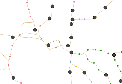
When multiple points are clustered together, @cluster_color will be set to match the color of any contained points. The points must all have the same color, if they differ then @cluster_color will be null. It’s easiest to illustrate this concept! In the below mockup, we’ve used a categorized render to shade points by an attribute (in this case rail line segment name), and used an uninspiring dark grey circle for the cluster markers:
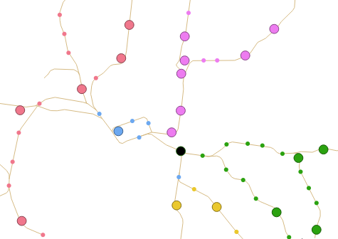
Using @cluster_color together with a data defined color override, we can force these cluster markers to retain the colors from the points within each cluster:
Much nicer! You’ll note that a single dark grey point remains, which is where the cluster consists of stations from multiple different line segments. In this case @cluster_color is null, so the data defined override is not applied and the marker falls back to the dark grey color.
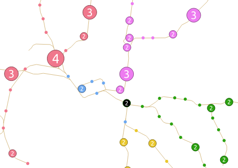
Of course, both @cluster_size and @cluster_color can be combined to create some very nice results:
So there we have it – using data defined overrides with the cluster marker renderer allows for extremely flexible, powerful cartography!
Now’s the time to get involved… if you’re wanting to see this feature in QGIS, head over to the crowd funding page to find out how YOU can contribute!

One thought on “Point cluster renderer crowdfunding – the final countdown!”
Comments are closed.